|
Complementary Colors are opposite each other on the color wheel. Choose a color and then use a straight line to find the color directly opposite on the color wheel. In the example below, cyan is the complement for red (in the RGB color wheel). You can even create "double complements" by combining two complementary pairs (such as orange & blue and green & purple). 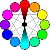
Since this example uses tones with the same contrast value, most people would see the Title, Background and Dolphin because all elements have "equal weight". You can create many different and interesting effects by changing the contrast for either color in this design (a lighter cyan, darker red, lighter red, etc.). Strengths: Opposite colors on the wheel are useful for developing bold, vibrant pages with high action between page elements. These simple, "two color" designs provide a lot of "punch" and flexibility. Weaknesses: These two-color schemes can be limiting in that they can lack the color versatility needed to focus the reader on many key areas. Also, text using a color complementary to the background will "vibrate". This means that you can not use these two colors as text/background combinations (notice the "previous button" on the left). Solutions to this problem include using neutrals or a lighter shade of the background color for text (Next Button is a lighter shade of cyan). This design uses the following colors:
(Continued on next page) |